What the 90-day chart reports
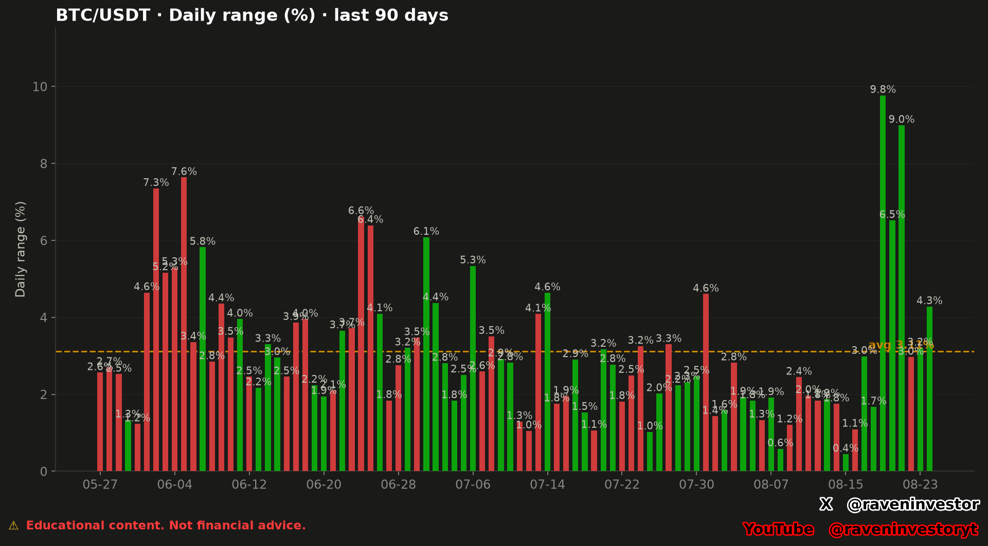
The supplied BTC/USDT chart displays daily range percentages for the last 90 days and marks an average at 3.1%. Its highest visible label is 9.8%, while its lowest visible label is 0.4%. These values are transcribed directly from the image and were not recalculated for this analysis.
A range percentage describes the magnitude assigned by the chart's method to each day. It does not, by itself, report the complete path followed during that day, identify a cause for the movement or determine what the next observation will be. The supplementary report now supplies the calculation convention, daily dates and color rule used below.
How to read the image
Each vertical bar presents one daily-range observation. The y-axis is expressed as a percentage, and the printed label above each bar gives the displayed value. Taller bars therefore correspond to larger reported daily ranges under the chart's methodology; shorter bars correspond to smaller ones.
The orange dashed line labeled “avg 3.1%”supplies a visual benchmark for the window. Bars ending above it have displayed ranges greater than that benchmark, while bars ending below it have smaller displayed ranges. The line describes the supplied sample and is not a forecast boundary.
Much of the middle portion contains values near or below the benchmark, interrupted by higher observations. The most prominent late group contains labels of 9.8%, 6.5% and 9.0%. The rightmost visible bar is labeled 4.3%, above the chart's displayed average.
What can be concluded from the red and green colors?
The supplementary report defines green as a positive open-to-close net change and red as a negative one. A red bar can therefore be tall: a large high-to-low range can accompany a close below the open. Its height is not a negative range, and green does not mean low risk.
The percentage above each bar is its range, not its net change. Color gives the sign of the latter, not its size. The report does not define a color for an exactly zero net change; rounded values alone cannot resolve that case.
Range and net change: dated examples
The supplementary report allows a comparison between the high-to-low range and the open-to-close change. The following days are selected to illustrate that distinction within the 90-day sample; they are not independent tests or a random sample. All figures are transcribed from the document without new calculations.
| UTC day | Range | Net change | Reading |
|---|---|---|---|
| 2026-06-02 | 7.35% | −6.53% | Close below the open; red bar. |
| 2026-08-15 | 0.44% | +0.06% | Smallest range in the sample; positive net change. |
| 2026-08-19 | 9.77% | +7.13% | Largest range in the sample; positive net change. |
| 2026-08-21 | 8.99% | +7.27% | Smaller range than August 19, but a larger positive net change. |
Comparing August 19 with August 21 shows why the tallest bar does not necessarily mean the largest advance between open and close. June 2, meanwhile, combines a large range with a negative net change. Height describes amplitude; color gives the direction between open and close. Neither alone reconstructs the sequence of intraday moves or explains their causes.
What the average does and does not say
The report states an average daily range of 3.11%, a maximum of 9.77% on August 19 and a minimum of 0.44% on August 15. The image displays these values to one decimal place: 3.1%, 9.8% and 0.4%, respectively. The additional precision comes from the report, not an estimate from the bars.
The average summarizes this 90-day window and can be affected by exceptionally large-range days. It does not mean that every day, or the next day, must cover that percentage. The report provides neither a median nor percentiles, so we do not present 3.11% as an established description of a typical day or as an expected trading interval.
Comparison within the supplied 90-day window
Earlier in the chart, visible high-range labels include 7.3% and 7.6%. A later group includes 6.6% and 6.4%, while another bar is labeled 6.1%. Near the end, the chart prints its two largest visible labels, 9.8% and 9.0%.
The sample size for this historical comparison is one 90-day window. It shows that the supplied period contains several separated episodes of larger daily ranges rather than one continuous block. It does not establish why those episodes occurred or whether another high-range day will follow. Historical similarity does not guarantee the same future outcome.
Source, sample and formulas
The reconstruction identifies the Binance USDⓈ-M BTCUSDT perpetual future and its public aggregate-trade archives as the source. RavenInvestor locally builds 1-second candles, then 1-minute candles and finally daily candles. The analysis concerns that contract, not all Bitcoin markets combined.
The sample contains 90 daily observations, from May 27 through August 24, 2026. Each day runs from 00:00 UTC to 00:00 UTC the next day and is identified by its candle’s opening date. Using another daily boundary can change the results.
- Daily range (%) = (high − low) / open × 100.
- Net change (%) = (close − open) / open × 100.
Both measures use the open as their denominator, but answer different questions. The range measures the separation between extremes, not the sum of every intraday rise and fall; net change compares only the close and open. The formulas explain the supplied method: the percentages were not recalculated for this article.
Supporting report and verification limits
The document is a later reconstruction anchored to August 24, 2026, not a report preserved since original publication. It includes all 90 rows of range and net change, allowing dates to be consulted without visual estimates. The original image is retained.
The declared 3,386,930,944 aggregate-trade records and 2,451 days refer to overall database coverage, not this 90-day sample. The September 16 frozen cutoff identifies the database used for reconstruction and does not extend the analysis period. The declared fingerprint is bf41db16f251aa76; its algorithm and included files are unspecified.
The August 13 net change appears as 0.00% in the report’s table. Without more precision, we cannot distinguish an exactly flat result from a small rounded one. We therefore do not adopt the summary’s positive- and negative-day counts as verified. Nor do we use its aggregate proportion between net movement and range as a rule for individual days.
The file is provided in full, including summary statements not adopted here. It does not attach daily open, high, low and close prices or the full aggregation code. It documents provenance and reported results, but is not an independent audit or a reproduction of the calculations from raw data.
Methodology and risk note
This analysis combines the original chart with the supplied reconstruction. No new financial calculations were performed. Range and net change describe different properties of a day; a wide range need not imply a large net move. Changing the daily boundary or observation window can change the results, and extreme days can influence the sample average.
Because no price levels are included, this article does not present a Levels to Watch section. Range magnitude is context, not a directional forecast, and neither the average nor an extreme guarantees that Bitcoin will rise, fall or repeat a prior path.