What the trend model reports
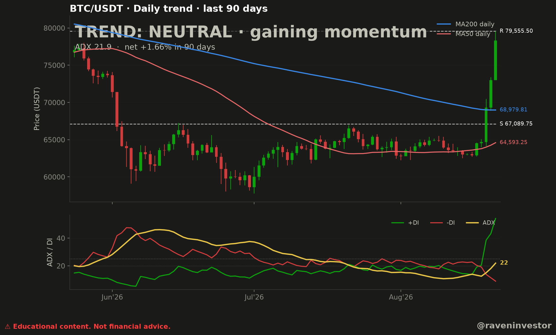
The supplied chart classifies the BTC/USDT daily trend as neutral while adding the qualifier gaining momentum. It also prints an ADX reading of 21.9 and a net result of +1.66% across the displayed 90-day period. These are direct observations from the image.
The lower panel labels the final ADX value as 22. That is consistent with the 21.9 value in the header when shown as a whole number. The supplementary reconstruction supplies the +DI and −DI readings discussed below.
“Neutral” and “gaining momentum” describe different parts of the model output. The first is its stated trend classification for the period; the second concerns strength at the historical endpoint, not today’s market. Neither label guarantees that Bitcoin will continue higher or reverse lower.
Price structure and the moving averages
The upper panel displays daily candles across a window marked as the last 90 days. Price declines through the earlier part of the chart, trades through a lower central region, and then advances sharply in the final visible candles. The later reconstruction reports a last close of 78,309.10 USDT. This value comes from the report, not an estimate from the image.
The blue MA200 daily line ends at 68,979.81 USDT. It slopes downward across the visible window. The red MA50 daily line ends at 64,593.25 USDT; it declines, flattens through the later middle portion, and turns upward at the right edge.
The latest visible candles are positioned above both moving average lines. This is an observed relationship at the chart timestamp. A cautious interpretation is that recent price action has improved relative to both displayed averages. Because averages are derived from earlier prices, this alone does not establish the next move or override the chart’s neutral classification.
What the ADX and DI panel shows
The lower panel contains three lines: +DI in green, −DI in red, and ADX in yellow. Near the right edge, the green +DI line rises sharply while the red −DI line falls. The yellow ADX line also turns higher and finishes at the displayed value of 22.
The observed directional balance therefore favors +DI over −DI at the chart timestamp, while the ADX line is gaining. This supports the chart’s own “gaining momentum” qualifier. The report supplies +DI at 54.2 and −DI at 8.9, with a 14-period lookback for ADX and DI. No additional spread is calculated here.
ADX describes modeled trend strength rather than direction; direction is read from the relationship between +DI and −DI. Here, the positive directional line is visibly dominant at the endpoint. That is evidence of the current configuration, not a prediction that the configuration must persist.
Levels to watch
| Level (USDT) | Chart role | Observed context |
|---|---|---|
| 79,555.50 | Resistance | The report’s nearest resistance remains above the last reported close. No later confirmation is supplied. |
| 68,979.81 | MA200 daily | The blue moving average ends at this labeled value below the reported close. |
| 67,089.75 | Support | The report’s nearest support lies below the MA200 endpoint. |
| 64,593.25 | MA50 daily | The red moving average ends at this labeled value and turns upward at the right edge; the model’s slope definition remains unspecified. |
These are references printed in the supplied chart. The image does not establish that resistance must reject price, that support must hold, or that either moving average will determine the next direction.
Source, window and method
The reconstruction identifies the Binance USDⓈ-M BTCUSDT perpetual future and its public aggregate-trade archives as the source. RavenInvestor locally builds 1-second candles, then 1-minute and finally daily candles. Indicators and classification are outputs of RavenInvestor’s processing, not a verdict published by Binance.
The analysis sample contains 90 daily candles, from May 24 through August 21, 2026, in UTC. Dates identify each candle’s opening. The last reported close, 78,309.10 USDT, belongs to that historical window; it is not a live quote.
The report specifies daily MA50 and MA200, 14-period ADX/+DI/−DI and 14-period RSI. It does not specify the exact moving-average type, indicator initialization and smoothing, or the preceding history used for MA200. The displayed 90-candle window should therefore not be confused with the full input needed to reproduce the indicators.
The eight signals behind the reported result
The report assigns equal weight to each signal and declares four favorable, three unfavorable and one neutral, with a total score of +1 and a neutral classification. The table transcribes that output; it is not a recalculation or independent validation of the model.
| Signal | Reported score | Evidence and limits |
|---|---|---|
| Price versus MA200 | +1 | Reported close above MA200. |
| Price versus MA50 | +1 | Reported close above MA50. |
| MA50 versus MA200 | −1 | MA50 remains below MA200. |
| MA50 slope | −1 | Reported signal; measurement window is unspecified. See the caveat below. |
| MA200 slope | −1 | Reported signal; exact slope formula and window are unspecified. |
| Net change | +0 | The report assigns a neutral score; its threshold is unspecified. |
| +DI versus −DI | +1 | +DI at 54.2 exceeds −DI at 8.9. |
| RSI above 50 | +1 | RSI(14) is reported at 86.0. |
Caveat: the MA50 slope needs a definition
The report scores the MA50 slope at −1, while the red line turns upward at the chart’s right edge. A slope measured over another interval could explain both observations, but that interval and its formula are not supplied. We do not assert a confirmed error: this signal remains unverified, preventing independent validation of the complete score.
The exact thresholds mapping the score to a category, and those assigning +0 to the +1.66% net change, are also absent. Neutral is therefore this rule-based system’s reported label, not a universal conclusion derived from the close or ADX alone.
Recent improvement and background structure are not the same
Observation: the reported close is above MA50 and MA200, and +DI exceeds −DI. At the same time, MA50 remains below MA200. Interpretation: recent directional strength coexists with a moving-average ordering that has not yet aligned with that improvement. This reading rests on the reported levels and indicators without depending on resolution of the ambiguous slope.
The +1.66% summarizes the change between the endpoints of the 90-candle window; it does not describe a uniform advance. The chart shows an initial decline and a later recovery. Likewise, RSI(14) at 86.0 adds another endpoint reading, but the report supplies no evidence that this value predicts a decline or an upward continuation.
The supported conclusion is a mixed configuration: recent improvement relative to the averages and +DI dominance, without supplied confirmation of what followed. Neither the score nor ADX is a success probability or a buy or sell instruction.
Supporting report and scope of verification
The document is a later reconstruction anchored to August 21, 2026, not a report preserved since original publication. ADX, net change, moving averages and levels match the image labels. The close, DI and RSI values and scores come from the supplementary report, not visual estimates.
The declared 3,386,930,944 records and 2,451 days describe overall database coverage, not the 90-candle sample. The September 16 frozen cutoff concerns that database, not the article’s period. The declared fingerprint is abfbcb582362a706; its algorithm and covered files are unspecified. These provenance details are not an independent audit and do not by themselves guarantee exact reproduction.
Methodology and risk note
This analysis combines the original RavenInvestor image with its later reconstruction report. No new financial calculations were performed. Missing thresholds, slope definitions, indicator settings and the support/resistance selection method limit exact reproduction. The reported model gives equal weight to its signals; different weighting could yield another verdict, and readings near its thresholds could change classification.
No historical comparison is included because no valid comparison sample was provided. Historical similarity, if a sample becomes available, would not guarantee the same future outcome.