What the supplied chart shows
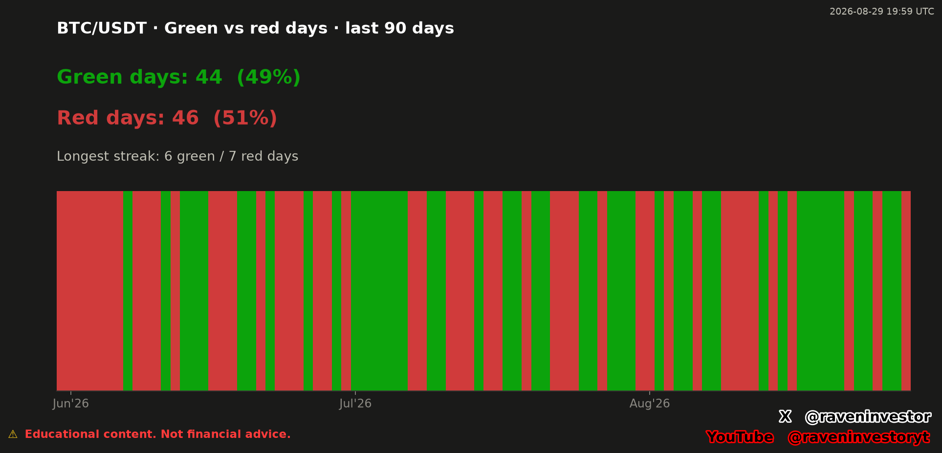
The chart reports 90 classified BTC/USDT days. Of those displayed observations, 44 are green, representing 49%, and 46 are red, representing 51%. These values are transcribed from the image and were not recalculated.
Observed: the red category has the larger published count and share, while both categories remain close in the supplied totals. The result describes this particular window only. It does not state the size of any daily price move or the cumulative return across the sample.
What each color actually means
The report documents a 90-day sample, from May 31 through August 28, 2026, in UTC. It compares the close with the same day’s open, not with the previous day’s close. The following counts and percentages are transcribed from the report; they are not new calculations.
| Category | Rule | Days | Share |
|---|---|---|---|
| Green | Close ≥ same-day open | 44 | 48.9% |
| Red | Close < same-day open | 46 | 51.1% |
An exactly flat day also counts as green. The report does not state how many days closed exactly at their opening price. We therefore cannot describe the 44 green days as 44 strictly positive days, or claim that the six-day green streak excluded unchanged days.
The original image retains the rounded shares of 49% and 51%. The report presents them more precisely as 48.9% and 51.1%, without changing the counts of 44 and 46. These are two rounding levels of the supplied result, not two different samples.
The color strip preserves sequence and highlights streaks
The lower panel arranges the daily classifications from left to right across the visible June, July and August labels. Green segments mark days assigned to the green category and red segments mark days assigned to the red category. The strip therefore shows both frequency and order, rather than presenting the counts alone.
The chart states a longest green streak of six daysand a longest red streak of seven days. A streak is a consecutive run inside the classification sequence. The image and report do not label the exact start and end dates of either longest run, so those dates cannot be identified from the supplied evidence.
What can be interpreted—and what cannot
Interpretation: the nearly divided count shows that neither color dominates the supplied 90-day classification by a wide visible margin. The sequence also shows that the observations were not simply alternating: runs of consecutive green and red days occurred within the sample.
Counts and streaks can help describe directional balance, organize a review of consecutive outcomes and provide context for a later comparison made under the same rules. They do not explain why a day received either classification, establish causality or measure the magnitude of the underlying moves.
Each day receives the same weight in the count regardless of move size. A near-even split therefore does not establish a near-zero cumulative return, a profitable strategy or a trading win rate. A green streak also need not consist entirely of strictly positive open-to-close changes, because flat days are green.
A green day is not evidence that the next day will also be green, and a red streak does not guarantee another red day or a reversal. The supplied history does not support a definite forecast for Bitcoin. The observed shares are not probabilities for tomorrow’s color.
Sample scope and historical comparison limits
The valid historical sample is one 90-day windowcontaining the 90 displayed classifications. No earlier 90-day window, alternative instrument, forward period or outcome study was supplied. A valid historical comparison section therefore cannot be produced from the available data.
Future comparisons should use compatible sources, daily boundaries, classification rules and treatments of incomplete or unchanged days. Historical similarity does not guarantee the same future outcome, even when two windows show comparable counts or streaks.
Source and construction of UTC trading days
The declared source is the Binance USDⓈ-M BTCUSDT perpetual future, through its public aggregate-trade archives. RavenInvestor locally builds 1-second candles, then 1-minute candles and finally daily candles. The results describe that contract and candle construction, not all Bitcoin markets.
Each day runs from 00:00 UTC to 00:00 UTC the following day and is identified by the candle’s opening. After assigning colors by comparing close with open, days in each category and consecutive runs of the same color are counted. A streak is a sequence of classifications, not a sum of returns.
The last sample date is August 28, 2026. The original image’s August 29, 2026 at 19:59 UTC timestamp belongs to the chart and does not extend the analyzed period. Candles, percentages and streaks were not recalculated for this article.
Supporting report and verification limits
The supporting report is a later reconstruction anchored to August 28, 2026, not a report preserved since original publication. The original image is retained; the report supplies provenance, the window and rules that were not printed in it.
The 3,386,930,944 aggregate-trade records and 2,451 days describe the declared overall database coverage, not the size of this 90-day sample. Its September 16 frozen cutoff belongs to the reconstruction database and does not extend the analyzed period. The declared fingerprint is d5d0d4ba1b50dd3c; its algorithm and included files are unspecified.
The complete daily series and candle-building code are not attached. The number of exactly flat days, dates of the longest streaks and detailed treatment of missing data and incomplete days are also unreported. The document lets readers inspect definitions and published results, but is not an independent audit; we do not claim to have reproduced the calculations from raw trades.
The file is retained in full. This article refers to color streaks, not consecutive gains, and does not adopt a general rule that the green share must rise in a bullish phase: these counts do not measure move size or establish that relationship.
Methodology and risk note
This analysis combines the original chart with the supplied reconstruction report, keeping observed counts separate from interpretation. No new financial calculations were performed. Results describe one 90-day window under the documented daily rules; different definitions or windows can produce different classifications. Historical similarity does not guarantee the same future outcome.