What the supplied chart reports
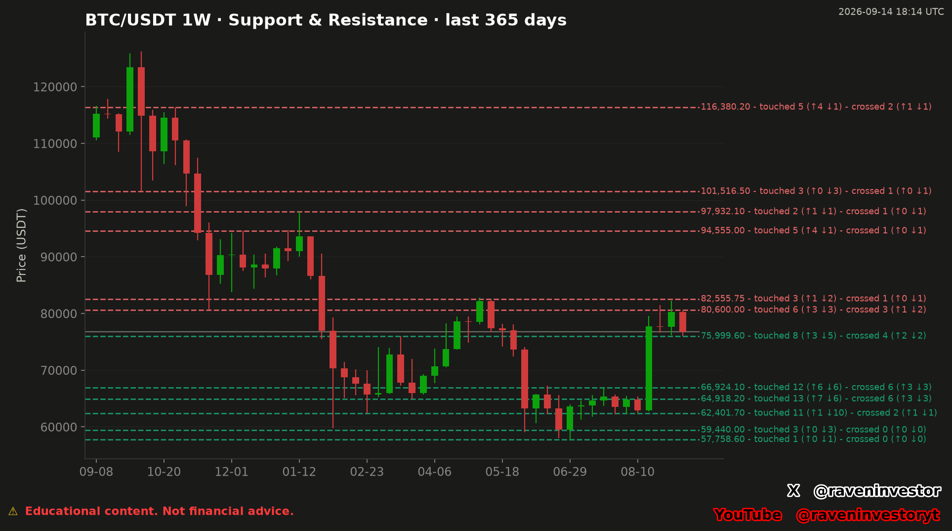
Observed: the image presents BTC/USDT weekly candles across a stated 365-day window. Red dashed lines mark the displayed resistance set, while green dashed lines mark the displayed support set. Each label includes total touches, total crosses and an upward/downward breakdown.
The highest displayed support is $75,999.60, labeled with 8 touches—3 upward and 5 downward—and 4 crosses—2 upward and 2 downward. The lowest displayed resistance is $80,600.00, labeled with 6 touchessplit 3 upward and 3 downward, and 3 crossessplit 1 upward and 2 downward.
A gray horizontal reference appears between those two levels, but the image does not print its numerical value. The chart therefore supports identifying the levels on either side of that reference; it does not support stating the exact current price or calculating its distance from either line.
How to read the weekly structure
Each candle represents one week. The dashed horizontal levels summarize prices selected by the supplied model, while the annotations preserve the frequency and direction of the model’s recorded interactions. The image does not provide the tolerance used around a level or the exact rules that distinguish a touch from a cross.
A touch count says that the model recorded interaction with the level under its own rules. A cross count says that the model recorded passage through the level. These counts describe the supplied historical sample. They do not assign a probability to the next interaction and do not prove that a frequently tested level will hold.
The weekly candles show a broad decline from the upper portion of the chart, a prolonged lower-price section, and a later move back toward the band between $75,999.60 and $80,600.00. That sequence is visible in the supplied image. Its causes are not supplied and cannot be inferred from price and level annotations alone.
Levels to Watch
“Watch” means observe how later weekly candles interact with the model’s marked prices. It is not a prediction that any level will be reached, rejected or crossed.
Displayed resistance levels
- $80,600.00: 6 touches (↑3, ↓3); 3 crosses (↑1, ↓2).
- $82,555.75: 3 touches (↑1, ↓2); 1 cross (↑0, ↓1).
- $94,555.00: 5 touches (↑4, ↓1); 1 cross (↑0, ↓1).
- $97,932.10: 2 touches (↑1, ↓1); 1 cross (↑0, ↓1).
- $101,516.50: 3 touches (↑0, ↓3); 1 cross (↑0, ↓1).
- $116,380.20: 5 touches (↑4, ↓1); 2 crosses (↑1, ↓1).
Displayed support levels
- $75,999.60: 8 touches (↑3, ↓5); 4 crosses (↑2, ↓2).
- $66,924.10: 12 touches (↑6, ↓6); 6 crosses (↑3, ↓3).
- $64,918.20: 13 touches (↑7, ↓6); 6 crosses (↑3, ↓3).
- $62,401.70: 11 touches (↑1, ↓10); 2 crosses (↑1, ↓1).
- $59,440.00: 3 touches (↑0, ↓3); 0 crosses (↑0, ↓0).
- $57,758.60: 1 touch (↑0, ↓1); 0 crosses (↑0, ↓0).
Historical comparison: one 365-day weekly window
The stated historical sample is one 365-day windowshown with 1-week candles. It allows comparison among the interactions displayed inside that window, but it is not a collection of independent market cycles or matched analogs. The exact number of eligible weekly candles was not supplied.
Within this sample, the largest displayed touch total belongs to the $64,918.20 support, with 13 touches and 6 crosses. That is an observed ranking among the printed labels, not proof that this level is more likely to hold in the future.
Historical similarity does not guarantee the same future outcome. A later candle can behave differently even when it approaches a price that previously accumulated touches or crosses.
Interpretation and limits
Interpretation: the chart supplies a conditional map. The band bounded by the highest displayed support and lowest displayed resistance gives readers a defined area in which to monitor subsequent weekly behavior. The remaining lines show the next displayed references above and below, without forecasting a path.
Interaction counts add context, but more touches do not automatically mean greater strength. Repeated testing, model tolerance, data quality and the chosen lookback can all affect the labels. None of those parameters can be audited from the image alone.
The chart does not establish why price moved, whether an interaction was driven by buyers or sellers, or whether BTC/USDT will rise or fall. It also does not supply a trading entry, target, stop or personalized action.
Methodology and risk note
This analysis transcribes the RavenInvestor image timestamped September 14, 2026 at 18:14 UTC. The chart states a BTC/USDT market, a 1-week timeframe and a 365-day window. No new financial calculations were performed.
The supplied material does not identify the trading venue, data provider, candle price field, level-selection algorithm, grouping tolerance, definitions of touches and crosses, treatment of incomplete weeks or validation history. These omissions prevent exact independent reproduction from the image alone.