Latest model output
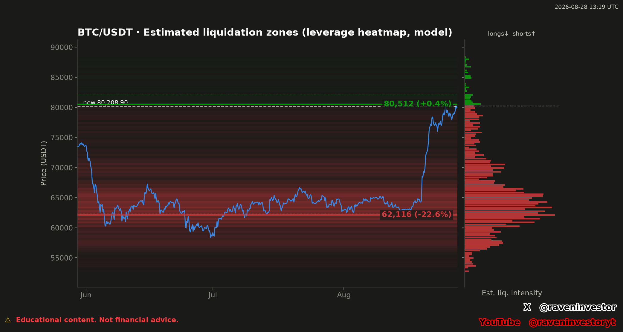
Latest BTC/USDT liquidation heatmap
The most recently published RavenInvestor model chart. It changes when a new image is uploaded and is not a real-time market feed.
Reading the chart
What the visual elements represent
- The dashed line marked “now” is the model's displayed reference price when the chart was generated.
- The colored horizontal bands represent estimated liquidation intensity at different price areas, following the chart's own long/short legend.
- The profile on the right summarizes the model's estimated intensity by price.
These are model estimates. Greater visual intensity does not prove that actual liquidations are present at a level or that price will move toward it.
Update policy
Latest available, not live
This page displays one fixed image that RavenInvestor replaces when a new model output is available. It does not update between uploads and does not retain earlier versions.
The server file time reports when the image changed on the host; it should not be treated as the exact market-data timestamp unless that timestamp also appears inside the chart.
Risk note
Estimated zones are not forecasts
The heatmap is general educational information. It does not guarantee that Bitcoin will rise, fall, reach a highlighted area, or reproduce a historical path. It is not personalized financial advice.