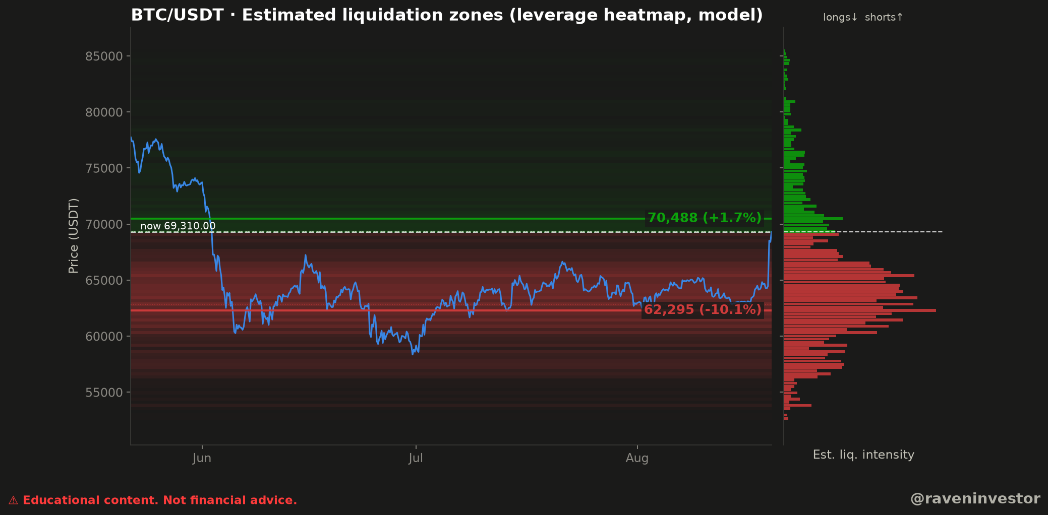
How to read this BTC/USDT heatmap
The blue line shows the visible BTC/USDT price path across a period labeled June, July, and August. The dashed horizontal line marks the displayed current price at $69,310. The legend identifies green zones above price with shorts and red zones below price with longs.
The right-hand profile summarizes estimated liquidation intensity at each price. Longer horizontal bars indicate greater relative intensity within this model. The supporting report supplies notional weights, not verified dollar amounts of positions that will be liquidated.
The upper zone: $70,488
The chart highlights a green line at $70,488, labeled +1.7% relative to the displayed price. Under the chart’s legend, this is an estimated short-liquidation zone.
The observation is proximity: this highlighted upper zone is shown close to the current-price marker. The interpretation is conditional. If price moves into that area while the modeled positioning remains relevant, short positions represented by the model may face greater pressure. The chart does not establish that such a move will happen.
The lower field: $62,295
Below the current-price line, the heatmap displays a broader field of red bands. Its emphasized level is $62,295, labeled −10.1%. The chart’s legend associates the downside red zones with estimated long liquidations.
This is a wider downside field rather than a single isolated stripe. It indicates that the model places estimated long-liquidation intensity across multiple lower price bands, with $62,295 specifically highlighted. It does not show that all positions in that region would liquidate at once.
What the two sides show together
The nearest specifically labeled zone is above the displayed price at $70,488. The lower highlighted level at $62,295 is farther away, while the red heatmap occupies a broader area below the market. This describes the model’s visible asymmetry at the chart timestamp; it is not a directional forecast.
Levels to watch
| Level | Chart label | What it represents |
|---|---|---|
| $70,488 | +1.7% | Highlighted estimated short-liquidation zone. |
| $69,310 | Now | Displayed current-price marker in the supplied chart. |
| $62,295 | −10.1% | Highlighted estimated long-liquidation zone. |
Source and construction of this sample
The reconstruction report identifies the Binance public aggregate-trade archives for the USDⓈ-M BTCUSDT perpetual future as the source. RavenInvestor builds 1-second candles, then 1-minute and finally 4-hour candles. The zones are RavenInvestor calculations, not position or liquidation data published by Binance.
The specific sample contains 540 four-hour candles, from May 22, 2026 at 00:00 through August 19, 2026 at 20:00 UTC. Timestamps identify candle openings. The historical reference price is 69,310.00, not a live quote.
- Typical price (high + low + close) / 3 approximates each candle’s entry price.
- That price is multiplied by candle volume to obtain a notional weight.
- The weight is allocated equally across assumed leverage of 10×, 25×, 50× and 100×.
- For each leverage L, the model places longs at entry × (1 − 1/L) and shorts at entry × (1 + 1/L). These are model approximations, not Binance’s complete liquidation formulas.
- Results are grouped into price bins and intensity is accumulated per level. The report does not specify bin edges or the exact discretization rule.
The ten zones in the reconstructed report
Rows preserve the intensity ranking within each side. The principal levels of 62,294.62 and 70,487.62 round to the 62,295 and 70,488 highlighted in the original image.
| Modeled side | Reported level | Reported distance | Model intensity (B) |
|---|---|---|---|
| Longs | 62,294.62 | −10.1% | 42.13 |
| Longs | 62,859.65 | −9.3% | 37.38 |
| Longs | 61,447.07 | −11.3% | 36.33 |
| Longs | 62,012.10 | −10.5% | 32.49 |
| Longs | 63,424.69 | −8.5% | 30.38 |
| Shorts | 70,487.62 | +1.7% | 19.08 |
| Shorts | 69,357.55 | +0.1% | 16.57 |
| Shorts | 69,922.59 | +0.9% | 16.31 |
| Shorts | 69,640.07 | +0.5% | 14.38 |
| Shorts | 70,770.14 | +2.1% | 11.40 |
B expresses billions of model notional-weight units. It does not represent verified open positions, money awaiting liquidation or expected losses. The report labels amounts as approximate USD; the analyzed contract is quoted in USDT, and no conversion between these units is performed here.
Proximity and intensity describe different things
The principal short zone is reported at +1.7%, while the principal long zone is at −10.1%. Yet the latter has greater intensity: 42.13B versus 19.08B. The closer principal level is therefore not the more concentrated modeled level. Distance describes separation from the reference price; intensity summarizes the allocation of model weights.
The report also shows a short zone at 69,357.55, +0.1%, with 16.57B intensity. This refines the image reading: 70,488 is the highlighted upper zone, not the nearest of all reconstructed zones. Greater concentration does not imply a higher probability of price reaching that level.
The supported conclusion is an asymmetry within this model and sample: the listed long-side intensity peak is larger but farther away than the listed short-side peak. The map does not establish a future direction or how many positions would remain open if a zone were reached.
Supporting report and scope of verification
The document is a later reconstruction anchored to August 19, not a report preserved since original publication. Agreement in highlighted levels and reference price does not by itself constitute an independent reproduction of the entire map.
The September 16 frozen cutoff describes the database used for reconstruction, not the end of the analyzed window. Likewise, the declared 3,386,930,944 records and 2,451 days refer to overall database coverage, not this 540-candle sample. The declared fingerprint is bff7281bb433924c; the report does not specify its algorithm or covered files.
The original report includes a claim that 76% of mass lies below price. It is not adopted as a verified finding in this article: its denominator and the full distribution needed to check it are missing.
Methodology and risk note
This analysis combines the original chart with RavenInvestor’s supporting historical reconstruction. Reported values are not an independent recalculation of the Binance archive. No forward-return study or independent historical comparison was supplied, so no predictive success rate is asserted.
The model assumes entries follow candle volume and distributes weight equally across the listed leverage settings. It does not account for isolated versus cross margin, additional collateral or positions already closed. Changing leverage assumptions changes the zones. Historical similarity does not guarantee the same future outcome; these dated estimates are not live levels.