What the supplied chart shows
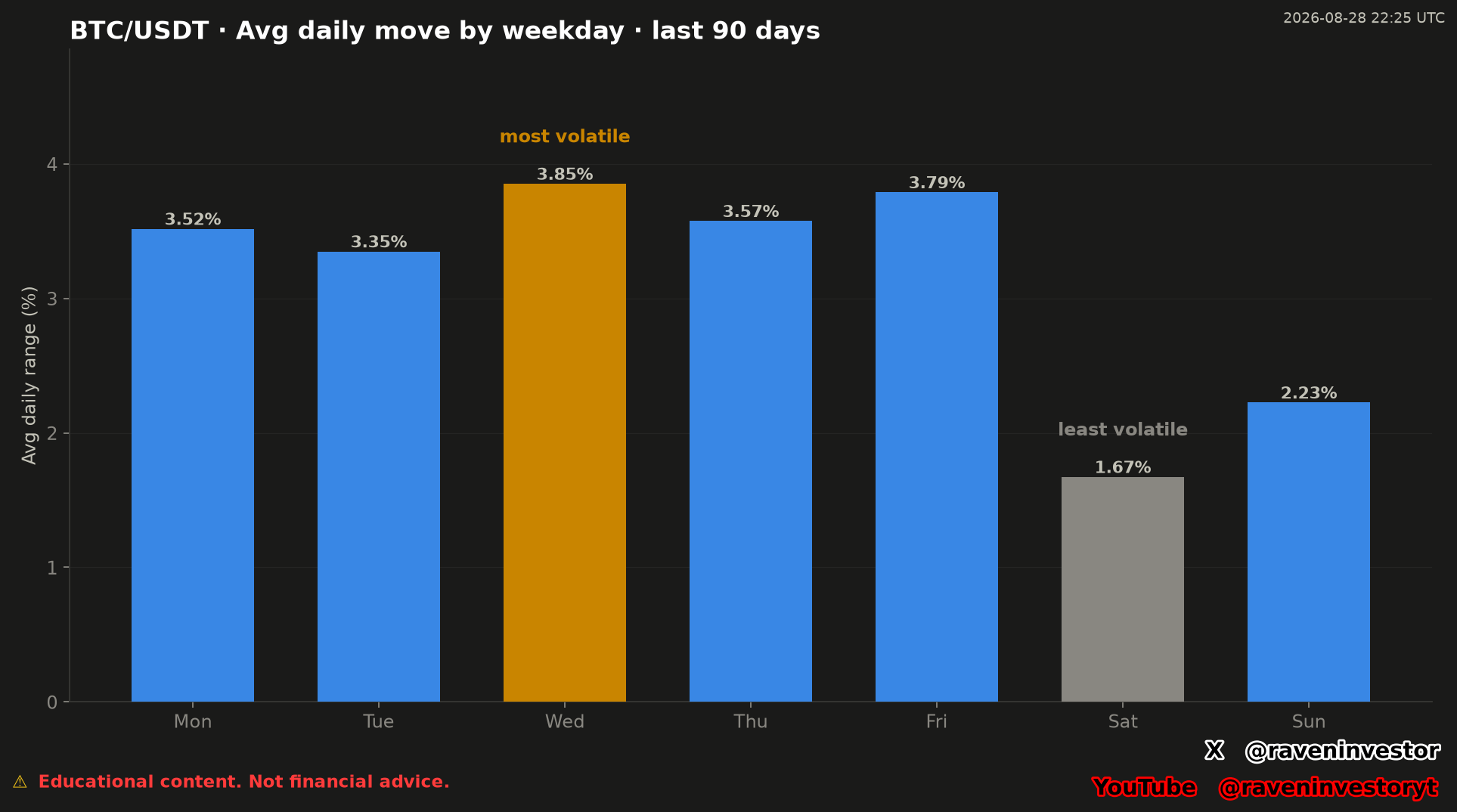
The chart presents one 90-day BTC/USDT sample grouped into seven weekday categories. Its vertical axis is labeled average daily range in percent. Each bar therefore reports the published average for one weekday within this specific window rather than the result of one individual day.
The labels show Monday at 3.52%, Tuesday at 3.35%, Wednesday at 3.85%, Thursday at 3.57%, Friday at 3.79%, Saturday at 1.67% and Sunday at 2.23%. These values are transcribed directly from the supplied image and were not recalculated.
How many observations support each average
The reconstruction report supplies the sample sizes that were not printed in the chart. The window covers 90 days, from May 30 through August 27, 2026, in UTC. The averages match the original image’s labels; counts are transcribed from the report, without reconstructing them or calculating new statistics.
| Weekday | Average range | Observed days (n) |
|---|---|---|
| Monday | 3.52% | 13 |
| Tuesday | 3.35% | 13 |
| Wednesday | 3.85% | 13 |
| Thursday | 3.57% | 13 |
| Friday | 3.79% | 12 |
| Saturday | 1.67% | 13 |
| Sunday | 2.23% | 13 |
Friday has 12 observations; each of the other groups has 13. These are not seven 90-day samples or seven averages based on identical observation counts. The counts help define what each bar represents, but do not show how much daily ranges varied within each group.
Wednesday leads the displayed weekday averages
Observed: Wednesday has the tallest bar and is explicitly marked “most volatile” at 3.85% across 13 observations. Friday is the next-highest displayed category at 3.79% across 12 observations, followed by Thursday at 3.57%, Monday at 3.52% and Tuesday at 3.35%.
At the lower end, Saturday is marked “least volatile” at 1.67% across 13 observations, while Sunday is labeled 2.23%. The chart uses orange for the highest category, gray for the lowest and blue for the remaining five. In this image, color reinforces the stated highest and lowest classifications; no additional color rule is supplied.
Interpretation: Wednesday ranks above Friday in this sample, but the report does not establish that their difference is statistically significant. The ranking identifies the largest reported average, not a reliably superior day for a trading strategy.
“Most volatile” refers to the largest grouped average
In the context of this chart, “most volatile” means that the Wednesday group has the largest published average daily range among the seven weekday groups in the supplied sample. It does not identify the single day with the largest movement, and it does not state that every Wednesday had a larger range than every observation assigned to another weekday.
Interpretation: the grouping provides a compact description of how range magnitude was distributed by weekday inside this window. It may help organize later comparisons or identify which categories deserve a closer data review. It does not explain why the averages differ and does not establish a causal weekday effect.
A weekday label also does not predict direction. The image reports movement range, not whether BTC/USDT closed higher or lower on the days included in a category.
The report mentions the macroeconomic calendar as a limitation, but supplies no event-level analysis establishing a cause for these differences. We do not attribute the weekday ranking to specific news, announcements or participant behavior.
Comparison within the supplied 90-day sample
The valid historical sample is one 90-day window from May 30 through August 27, 2026, in UTC, with seven weekday aggregates. The report supplies 12 observations for Friday and 13 for each other weekday. These counts define the sample behind the published means; they do not show the dispersion within groups or establish an enduring weekday effect.
No earlier 90-day windows, distribution measures, confidence intervals or forward results were provided. The chart supports a comparison among its seven published values, but it does not establish whether this ordering is persistent. Historical similarity does not guarantee the same future outcome.
Source, formula and UTC grouping
The declared source is the Binance USDⓈ-M BTCUSDT perpetual future, through its public aggregate-trade archives. RavenInvestor locally builds 1-second candles, then 1-minute candles and finally daily candles. This analysis concerns that contract and candle construction, not a measurement of all Bitcoin markets.
Daily range (%) = (high − low) / open × 100. The range is obtained for each day first, then the ranges of days sharing the same weekday are averaged. The denominator is the opening price, not the previous close. The formula documents the supplied method; the report’s averages were not recalculated.
Each day runs from 00:00 UTC to 00:00 UTC the following day. The weekday is assigned by the candle’s opening, not each reader’s local calendar. The last sample date is August 27, 2026; the chart’s August 28, 2026 at 22:25 UTC timestamp does not extend the analyzed window.
This measure describes the span between high and low, not the open-to-close return or a standard deviation of returns. A high average range therefore does not represent a profit or identify market direction.
Supporting report and verification limits
The supporting report is a later reconstruction anchored to August 27, 2026, not a report preserved since original publication. The original image is retained, while the report documents its source, formula, window and group counts.
The 3,386,930,944 aggregate-trade records and 2,451 days describe the declared overall database coverage, not each group’s size or this 90-day sample. The September 16 frozen cutoff belongs to the reconstruction database and does not extend the chart period. The declared fingerprint is 59548243b3852f6f; its algorithm and included files are unspecified.
The file is retained in full, but this analysis does not adopt its overall average or its percentage difference between the extreme groups. It does not specify whether the overall average is weighted by observations or gives equal weight to groups of different sizes. The comparison base and rounding of the percentage difference are also undocumented. We do not replace those figures with our own calculations.
The report does not attach the complete daily candle series or aggregation code. It also does not detail the handling of missing data or incomplete days. Documented provenance and the fingerprint do not constitute an independent audit: we do not claim to have reproduced the results from raw trades.
Methodology and risk note
This analysis combines the original RavenInvestor chart timestamped August 28, 2026 at 22:25 UTC with the later reconstruction’s declared source, method and sample counts. No new financial calculations were performed. Averages across a limited window can combine quiet periods with unusually active days; the report does not supply the daily series needed to assess each observation’s influence.
Results depend on the supplied sample and generating method. A weekday with the largest historical average range in this chart is not guaranteed to remain the largest in another window, and none of the values guarantees that Bitcoin will rise, fall or reach a particular movement range.